Competition 2016: Shortlisted in the category Journalistic
Visualizing The Racial Divide
Bocoup, 2012
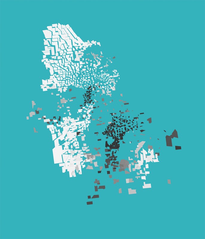
Visualizing the Racial Divide maps the proportion of white and black residents in 14 U.S. cities.
Each city is made up of tracts from the 2010 Census. Census tracts are pushed away from neighboring tracts based on the change in proportion of white and black populations between each neighboring tract.
Tracts that have a similar racial mix as their neighbors form groups. Spaces occur where there is a significant change in the racial makeup between neighboring tracts. The space is proportional to the change in racial composition between neighbors.
Visualizing the Racial Divide provides a startling, disorienting evocation of the gaps so commonly found between majority-black and majority-white neighborhoods: In many U.S. cities, economic segregation is associated with the share of black, Latino, or Asian residents. This project only offers a limited view of urban inequalities, but is still a powerful reminder of the realities of the unevenness of city population distributions.

